01
Surface & Salt
Indigo, sand, foam and weathered wood enter through material, light and negative space to suggest a coastal place with real texture.

MOULIN DE DA NANG · COASTAL DINING · F&B VISUAL SYSTEM
Hang Doi built Moulin de Da Nang a food-visual system with local character: red velvet, steam and a real dining table open the story, then a clear, consistent dish library carries it into menus, web, social and seasonal campaigns.
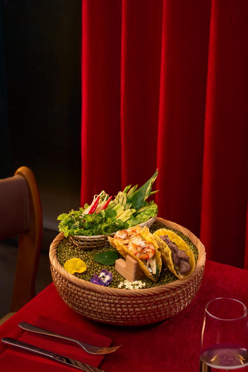
MOULIN DE DA NANGDining hero · red velvet · woven texture · food at the table
Key information
01 · The brief
The image system needs to do two jobs: cutout food photography that stays clear for menus and sales layouts, and concept photography that gives the brand mood, texture and a memorable world.
Hang Doi separated the shoot into two complementary directions: clean cutouts for deployment and contextual concepts for emotion. The team can choose the right image for each touchpoint while keeping one visual language.
02 · The visual system
Rather than making every frame identical, the system repeats red velvet, black, white and wood, then changes distance, texture and context to create rhythm.
Indigo, sand, foam and weathered wood enter through material, light and negative space to suggest a coastal place with real texture.
Dishes sit with wooden trays, a table and the gesture of sharing — close enough to imagine the experience, never a cold catalogue.
Red velvet, steam, red/black/white plates and Vietnamese dishes create an energetic signature for Moulin de Da Nang.
03 · Surface & Salt
A wooden tray, woven texture, a dark field and white porcelain can do more than a neutral backdrop: they place the food inside a coastal, tactile and lived-in feeling.
Wood · Woven texture · Indigo · Negative space04 · Food in Context
Trays and tabletop frames move the viewer beyond a cold catalogue. The dish has scale, distance and a reason to be shared.
Sharing · Table · Material · Real feeling05 · Local Warmth
Red velvet, steam and dark fields are the set’s signature. The hero layer creates emotion; plated frames keep food clear, legible and usable.
Red velvet · Steam · Coloured plates · Vietnamese food06 · Selected library
Browse the library by shooting direction. Open any image for a larger view; original ratios are preserved so the team can choose the right frame for the right placement.
Browsing the image library
07 · Project evidence
The statements below stay within the evidence available here: the cutout and concept directions, image ratios and the touchpoints shown. The case does not attribute revenue, bookings or operating metrics to the visual work.
Dishes are separated from the setting so the team can place them into menus, sales layouts and digital formats.
Red velvet, steam, wood and the dining table bring the food into a textured, memorable world.
Red velvet, black, white, wood and fresh greens create continuity without forcing every image into the same template.
The set keeps food close to a real table and real materials, avoiding generic seafood or a sterile hotel-outlet feeling.
Deployment
Cutout and concept images can be selected by use without losing recognition.
Evidence boundary: cutout and concept photography and the visual structure presented on this page. No operating metrics are published in this case.
08 · FAQ
Hang Doi directed and produced two image directions: cutout food photography for deployment and concept photography for brand atmosphere.
Cutouts prioritise clarity, clean edges and layout flexibility. Concepts prioritise setting, material, light and the feeling of dining.
The set combines coastal feeling, wood and woven material, a real dining table and a red-velvet/steam signature. The aim is local, textural, grounded and inviting.
Cutout and concept frames are suitable for menus, websites, social, new-dish launches, atmosphere content and partner materials.
No. The case presents production scope and visible image evidence only; it does not attribute business outcomes to the visual work.
Start with the place your brand owns
Send Hang Doi your menu, setting, priority season and required touchpoints. We will propose the image structure, art direction and production rhythm that fit.