
PREMIER VILLAGE DANANG RESORT · F&B VISUAL PRODUCTION · 2025
Making a Vietnamese menu part of the stay.
Hang Doi built a visual system for ten dishes at Cá Chuồn Cồ: every dish received 45-degree, flat-lay and detail frames, while the complete library told one story of the coast, Central Vietnam and resort dining.
- Client
- Premier Village Danang Resort
- Hang Doi role
- F&B visual production
- Dish scope
- 10 Vietnamese dishes
- Visual system
- 03 art directions
- Delivery
- 65 final images
01 · The brief
Ten different dishes should not become ten disconnected posts.
A resort menu needs to make guests want to order while holding onto the memory of where they are staying. The task was not simply to make food look appealing, but to set clear enough rules for the team to use the library across menu, social and property touchpoints.
Every dish was planned in three frame layers: a 45-degree view to open the story, a 90-degree flat lay to clarify composition, and 3–5 close details for texture, ingredients or gestures. That rhythm creates depth without losing a shared identity.
02 · The image system
One visual grammar, three emotional worlds.
The moodboard separated the menu into three visual languages — coastal freshness, deep teal & gold and Vietnamese heritage — so each dish family had character while remaining part of Cá Chuồn Cồ.
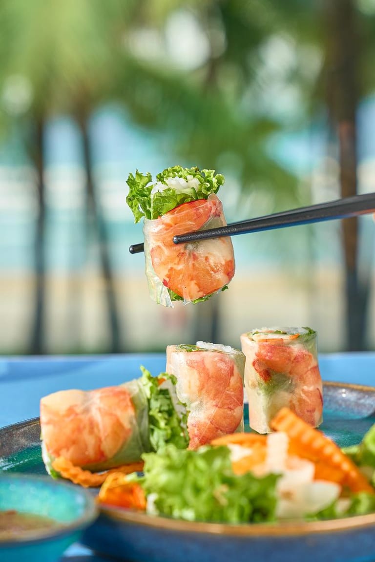
Coastal freshness
Sea, palms, teal and clean daylight put lighter dishes, rolls and Central Vietnamese flavours into an open, resort-led feeling.
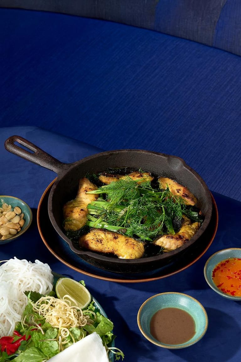
Deep teal & gold
Deep blue surfaces, wood, gentle smoke and gold accents give grilled dishes materiality, depth and a premium pace.
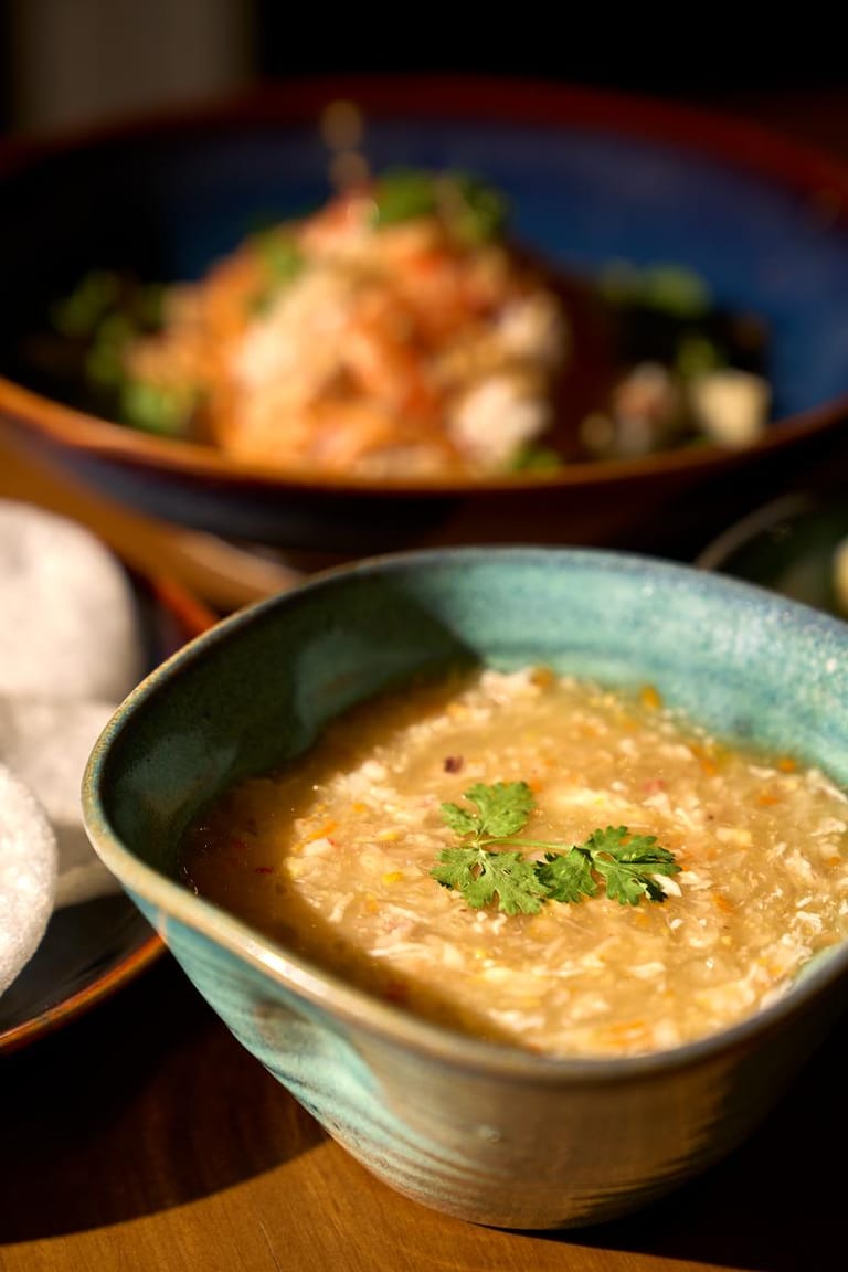
Vietnamese heritage
Warm red, gold and Vietnamese materials place noodle dishes and classics in a familiar but still refined visual register.
03 · Coastal freshness
The freshness of the coast becomes a layer of the dish.
The setting works as part of the story: teal, palms and daylight place the food within the right resort context.
Teal · Clean daylight · 45-degree view · Coastal cue
04 · Deep teal & gold
A deeper tone for grilling, material and slower moments.
Navy, wood, smoke and gold separate the dish from its background, emphasise texture and give stronger flavours a more deliberate mood.
Navy · Wood · Smoke · Gold accent
05 · Vietnamese heritage
Vietnamese dishes, told with warm colour, clear composition and intimate details.
Close frames and considered placement keep Vietnamese materiality at the centre, without turning food into props or losing the resort’s contemporary character.
Warm red · Gold · Ceramics · Dish details
06 · Curated library
25 frames from a delivery of 65 final images.
The library below shows 25 selected images in their intended landscape and portrait ratios. Select an image for a larger view; filters help teams find the format they need quickly.
07 · Project evidence
One image system can move from the menu to a real property touchpoint.
The statements below are limited to project evidence: the shot list, final image delivery and a documented deployment of the food creative at the resort. This case does not attribute bookings, revenue or operational performance to the visual work.
10 dishes · 3 art directions
The shot list separated dish families and visual worlds, so a broad menu did not blur into one generic message.
65 final images
The delivery included hero, flat-lay and detail frames so each dish could work in multiple formats without repeating the same view.
61 social-ready exports
Social-ready versions gave the team material to use after production instead of forcing crops from master files.
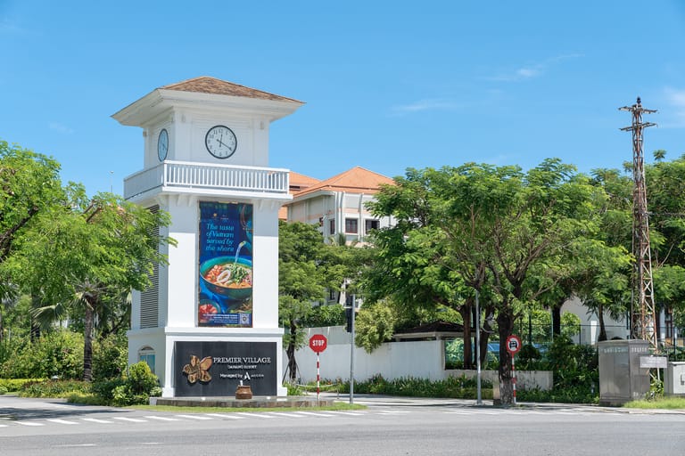
Creative documented at the property
A site photograph shows the food visual applied to an entrance-tower panel at Premier Village Danang Resort.
Documented deployment
From food imagery to a real resort touchpoint.
The food visual from this F&B system was documented on an entrance-tower panel at Premier Village Danang Resort. The image proves the asset’s use range; it is not an advertising-performance report.
Suitable applications
One system, many touchpoints.
Each ratio has a job. Landscape frames lead menus and landing pages; portrait frames extend social and offers; details maintain a useful rhythm for seasonal dish communication.
- F&B and restaurant pages
- Digital menus / in-room dining
- Social carousels & stories
- Seasonal offers
- Property signage
- Sales decks & press material
08 · FAQ
What a decision-maker needs to know.
What did Hang Doi create for Premier Village?
This was F&B visual production for ten dishes at Cá Chuồn Cồ, including art direction, shot-list planning and final image delivery across three art directions.
How many images were delivered?
The delivery included 65 final images and 61 social-ready exports. The case study presents 25 selected images for a quick review of the system.
What are the three art directions?
Coastal freshness for lighter dishes; deep teal & gold for grilling and materiality; Vietnamese heritage for traditional dishes in a warmer visual register.
Where can the visual library be used?
The 45-degree, flat-lay and detail frames were planned for menus, websites, social, seasonal offers, property signage and sales materials.
Does this case prove a booking or revenue result?
No. It describes visual-production scope and visible evidence of use; it does not attribute operational results to the image work.
Start with the dish system and touchpoints
Need a visual system that gives your property menu its own identity?
Share the menu, season, restaurant context, priority channels and formats your team needs. Hang Doi will recommend an art direction, shot list and production rhythm that fit.
Get a visual-system proposal Hospitality · F&B · Menu · Campaign visual