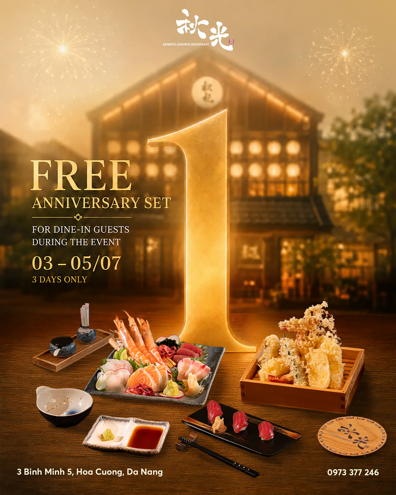
Food stays clear
The dish never disappears into decoration. Camera angle, light and crop make it immediately clear what customers are being invited to try.

CASE 08 / AKIMITSU
F&B / ONGOING PARTNERSHIP / DA NANG
VISUALS PARTNER
We did not reinvent the brand every month. As Akimitsu's visuals partner, Hang Đôi built a clear visual language so food, campaigns and everyday content always feel like one brand.
Explore the visual systemA SYSTEM, NOT A SERIES OF POSTS
Akimitsu needed ongoing content without losing its identity. The food had to be easy to understand, the brand had to stay visible and every campaign needed a clear reason to exist. Hang Đôi connected those needs in one visual system that could be reused, expanded and refreshed.
OUR ROLE
Each content cycle needs a new business goal, not a completely new visual style. The same brand logic keeps every new message connected.
02 / VISUAL SYSTEM
Akimitsu's visual system uses a small set of repeatable rules. Each asset has a clear job, while every asset still belongs to the same brand world.
Food first.
Decoration second.
The dish never disappears into decoration. Camera angle, light and crop make it immediately clear what customers are being invited to try.
The brand mark, practical information and booking prompt appear in a familiar order without competing with the main message.
A strong composition can become a post, cover or shorter format while keeping the same focus and visual structure.
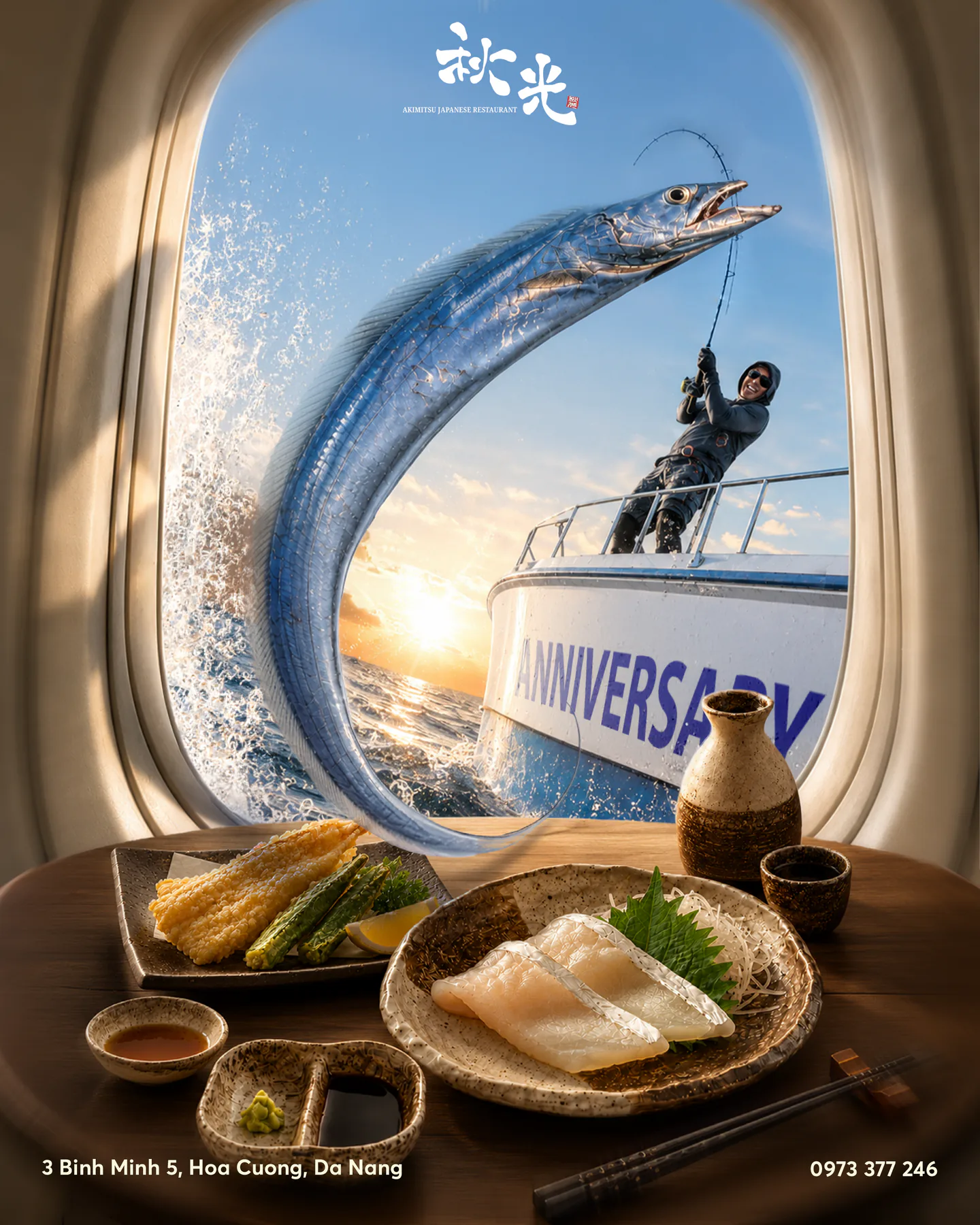
Each message gives customers a clear reason to act: discover a dish, book an experience, celebrate an anniversary or return.
VISUAL VOCABULARY
A brand is more than a colour palette. It is how colour, space, light, type and practical information work together in every piece of content.
Strong contrast gives food and messages a clear focus. Warm tones keep the brand welcoming.
We decide the frame and reading order before adding effects. This keeps every layout clear, even when the campaign theme changes.
The logo, timing and booking prompt are designed as useful information, not added as an afterthought.
03 / SELECTED WORK
Each month may need different content. Every piece still follows the same visual system, so the brand remains easy to recognise.
FOOD CLARITY SERIES
Dish details, textures and menu moments become a clear series of images that work alone or together.
Dish / detail / offer
work together.
STRUCTURED VIDEO SYSTEM
The same visual logic guides the cover, reveal, food sequence and final booking frame, so video content still feels unmistakably Akimitsu.
A clear visual direction supports multiple campaign releases without having to rediscover the brand voice each time.
ONGOING CONTENT BLOCKS
These repeatable content blocks keep the brand useful between major campaigns. Every post has a purpose instead of simply filling the calendar.
SYSTEM IN PRACTICE
04 / SYSTEM IN PRACTICE
The value of a visuals partner is not one hero image. It is a system that moves from food and campaigns to everyday content while keeping the message and next step clear.
HANG ĐÔI'S ROLE
Hang Đôi worked as a visuals partner. We defined what needed to stay consistent, what could change for each occasion and how every output could prepare the next content cycle.
One clear foundation for every format.
Food, campaigns and ongoing content.
Keep the brand consistent as messages change.
These points describe the visual system and the scope of work shown in this case study. They are not revenue or booking results, and they do not promise business performance.
PARTNER MODEL
A visuals partner does more than produce assets. The role protects what makes the brand recognisable, chooses where change will be useful and repeats the right elements so recognition grows over time.
Define what the brand needs to communicate in this cycle.
Keep the food, message order and brand presence consistent.
Create formats that work for campaigns and ongoing content.
Make every output useful for the next content cycle.
YOUR NEXT STEP
Hang Đôi helps hospitality and F&B brands define clear visual rules, plan practical content and build assets that keep working over time.